![[ STYLOFOAM ]](https://www.stylofoam.com/wp-content/uploads/2016/02/black-thin-medium-size.png)
![[ STYLOFOAM ]](https://www.stylofoam.com/wp-content/uploads/2016/02/white-thin3.png)
![[ STYLOFOAM ]](https://www.stylofoam.com/wp-content/uploads/2016/02/white-thin3-retina.png)
![[ STYLOFOAM ]](https://www.stylofoam.com/wp-content/uploads/2016/02/black-thin3.png)
![[ STYLOFOAM ]](https://www.stylofoam.com/wp-content/uploads/2016/02/black-thin3-retina.png)
Nat Spirit
Rebranding the Visual Identity
–
CLIENT:
Nat spirit – Tableware
(Barcelona, España & Paris, France)
OUR TASKS:
Concept
Art direction photoshoot
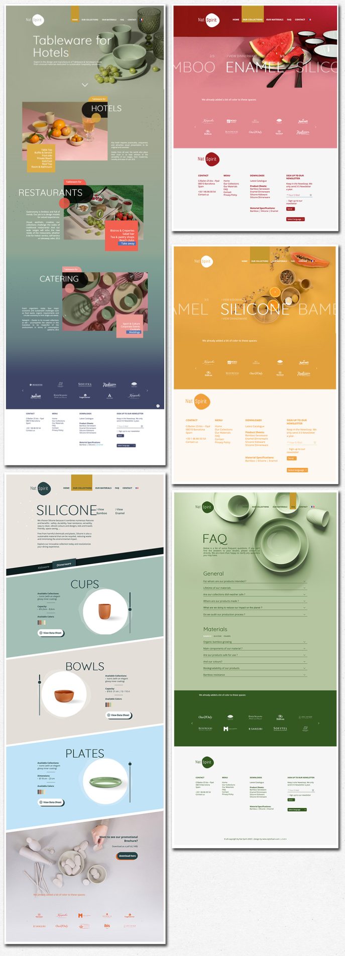
Web Design
Product Catalogue
Stand Design
–
A few years ago, we developed the branding for Nat Spirit, a tableware company working with bamboo with a strong commitment to ecological values and sustainable design.
Since then, Nat Spirit has expanded the range of materials used in its collections. While the ecological focus remains, the brand has evolved toward exploring unconventional materials and embracing a more colorful, contemporary aesthetic.
//Starting with Photography
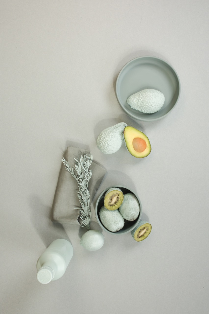
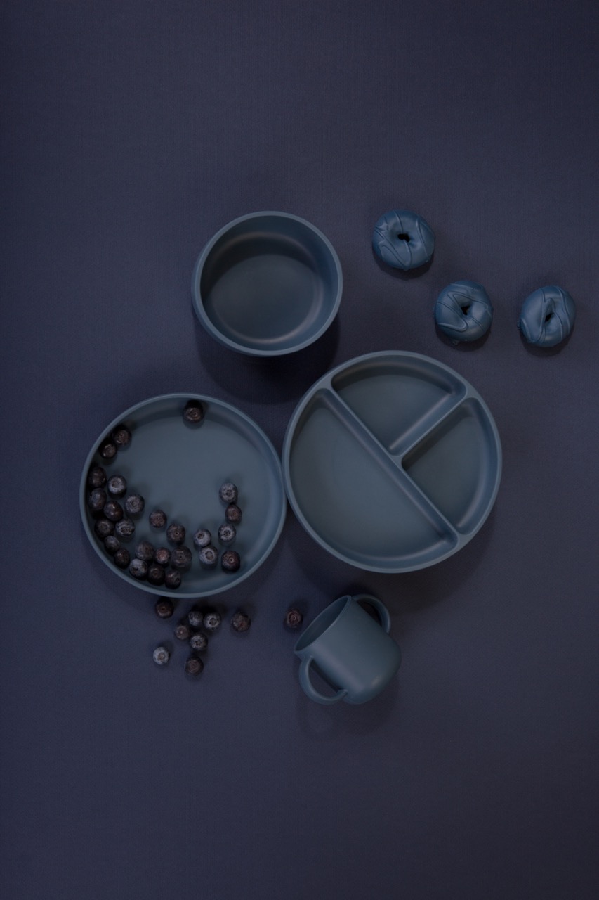
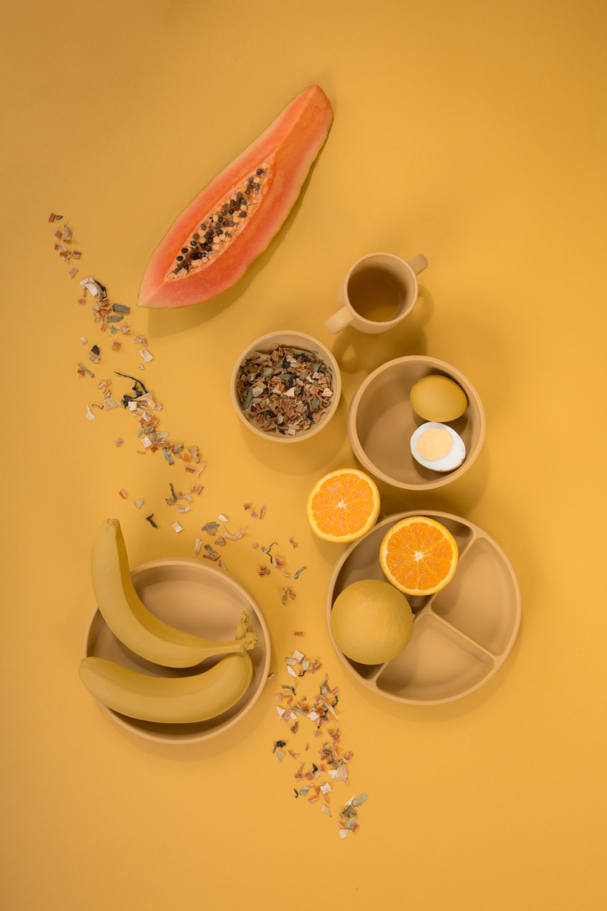
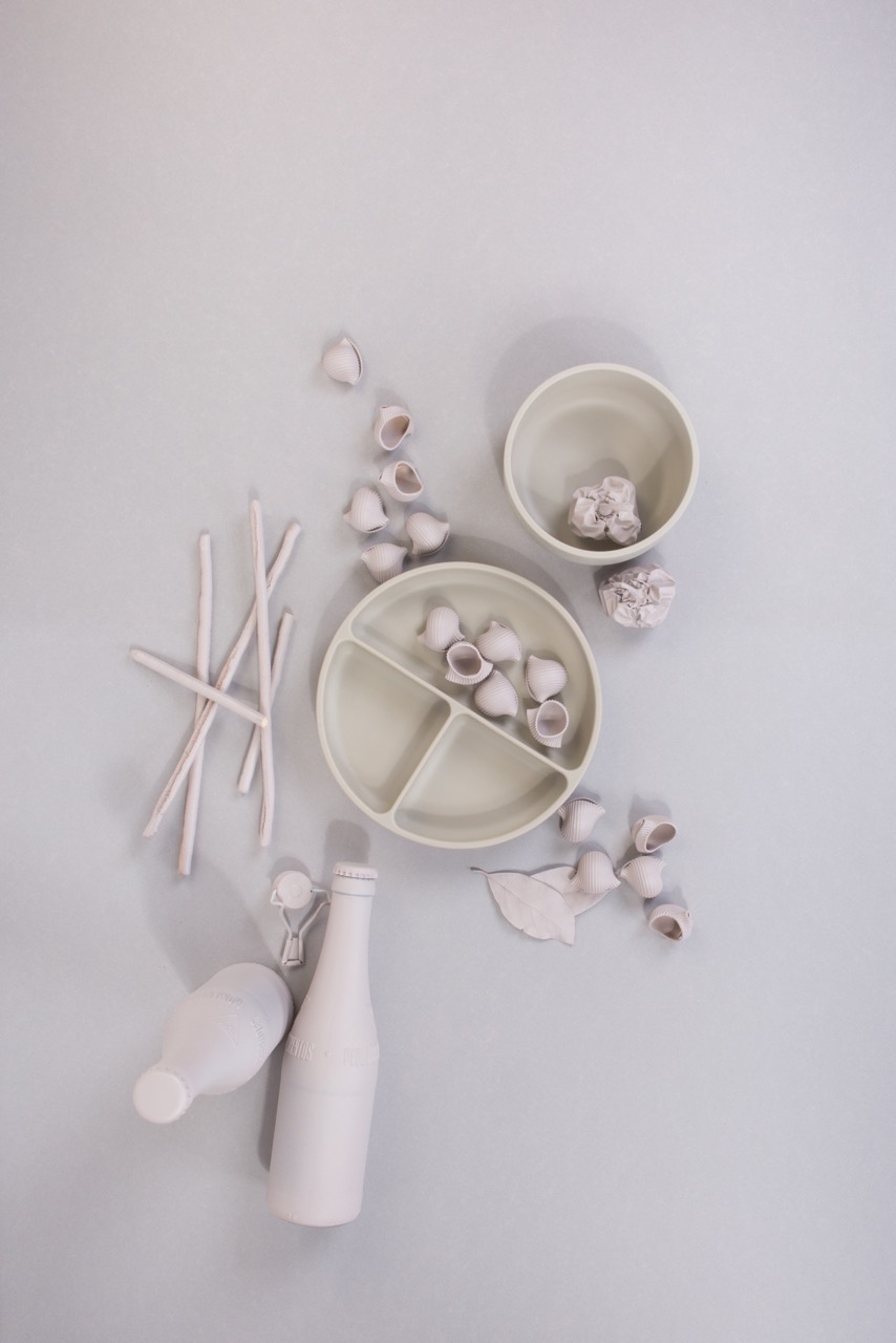
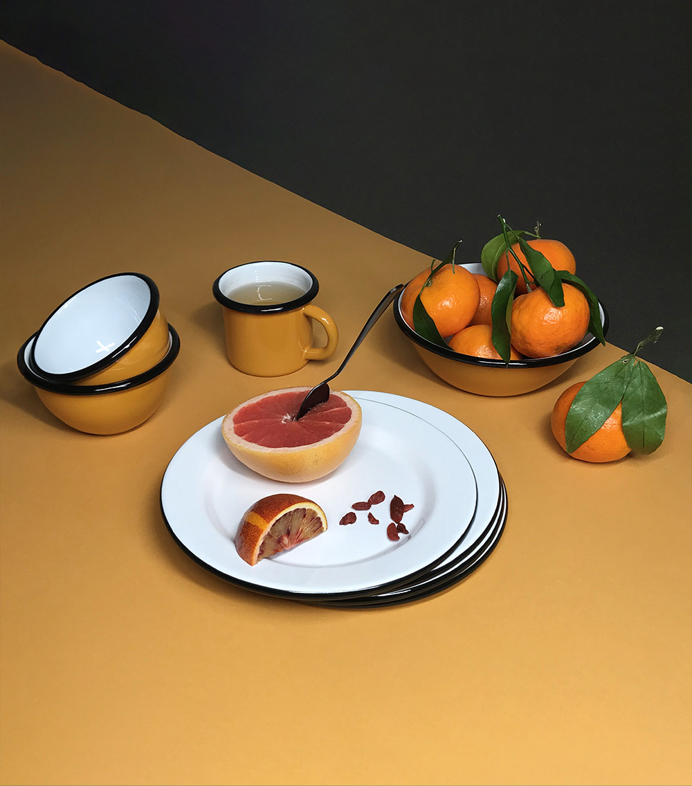
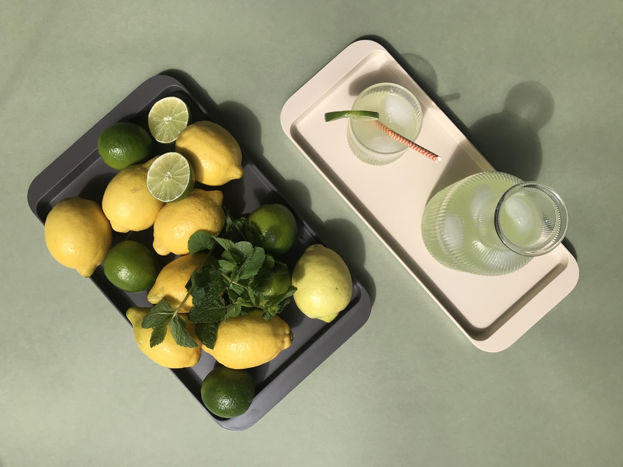
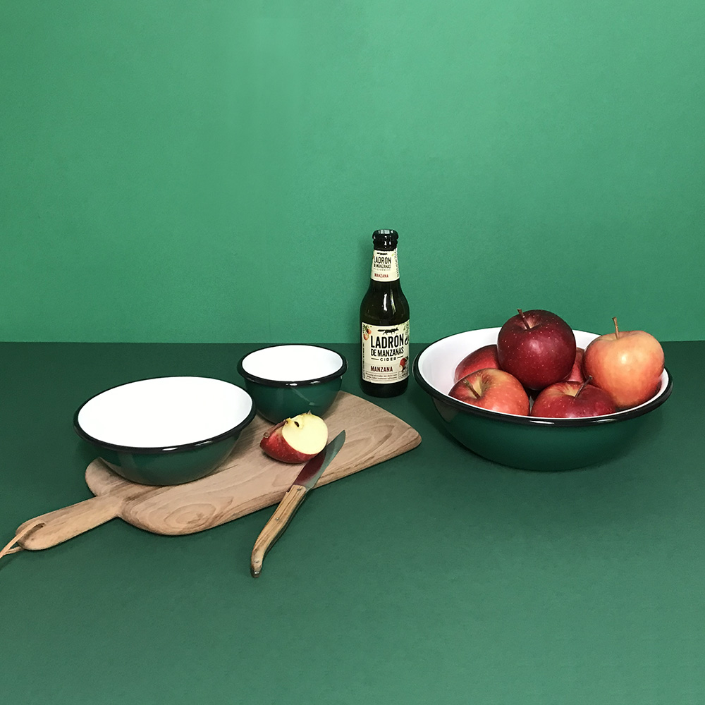
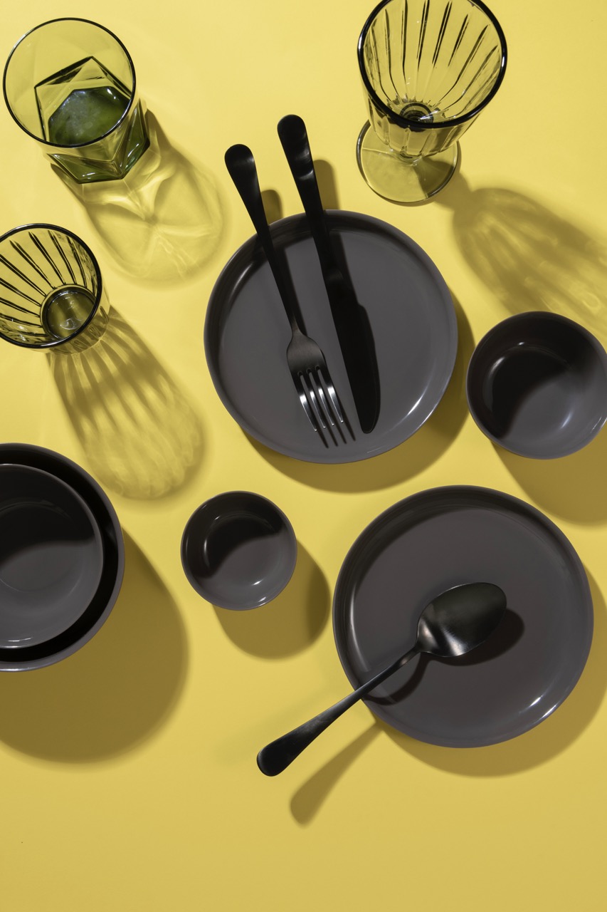
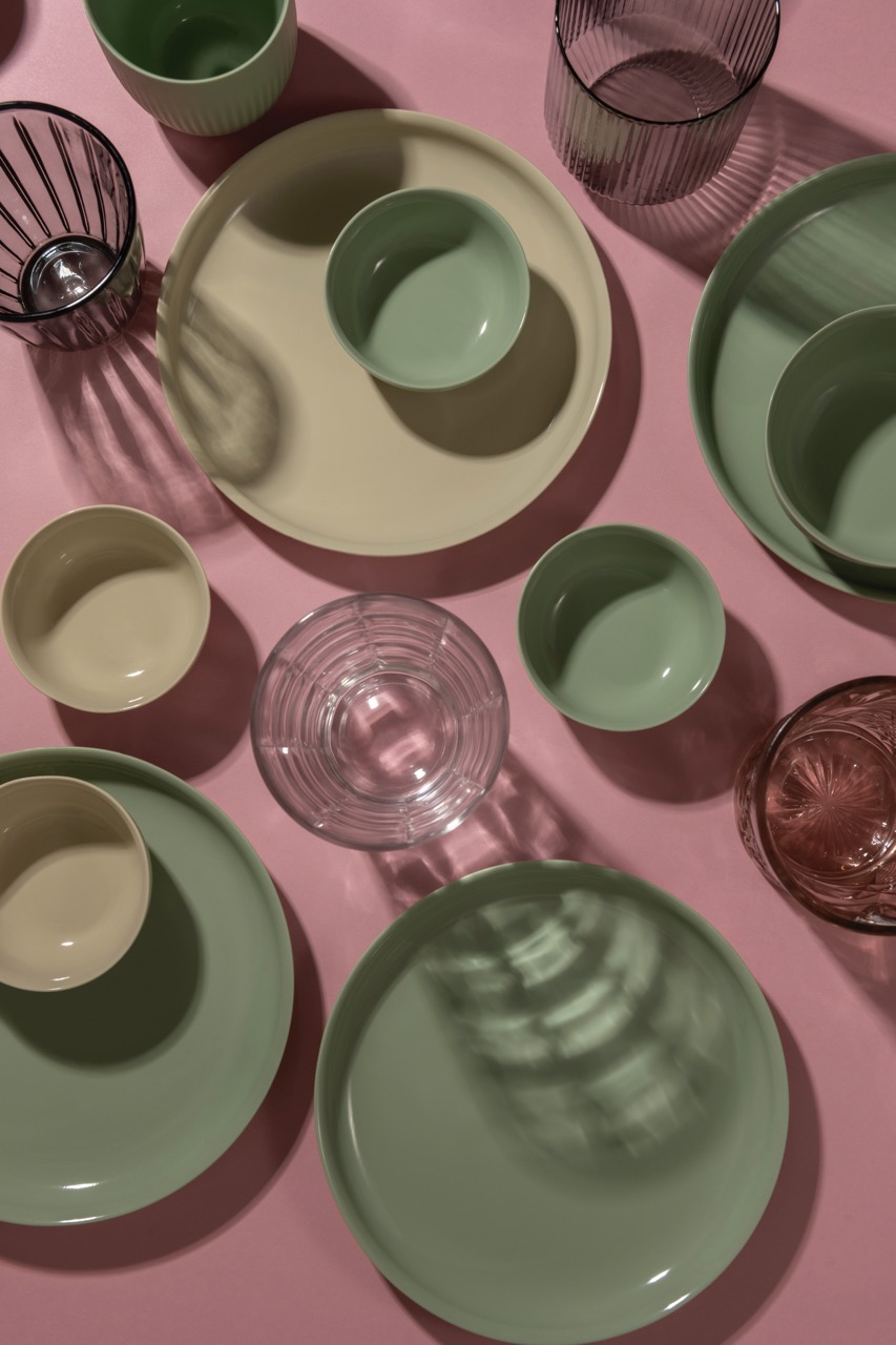
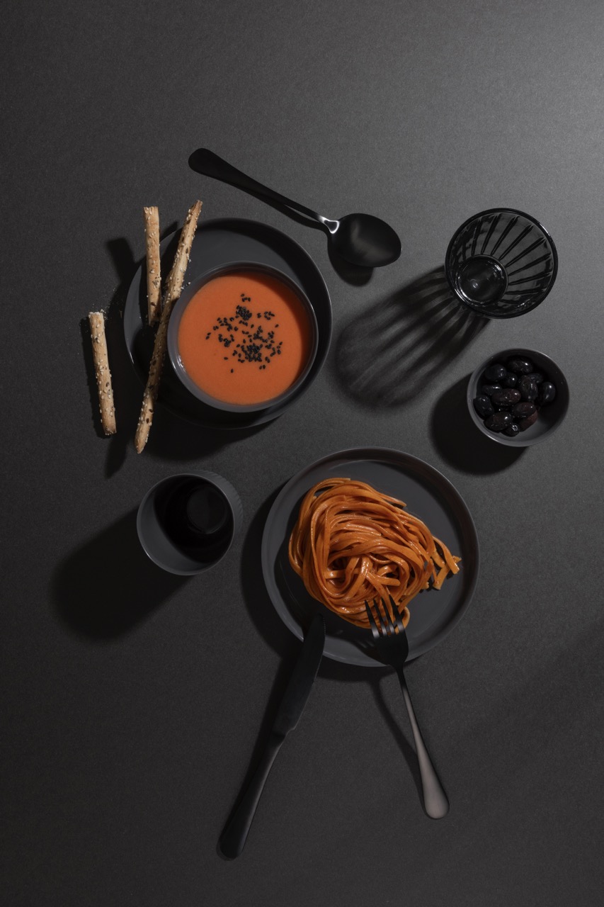
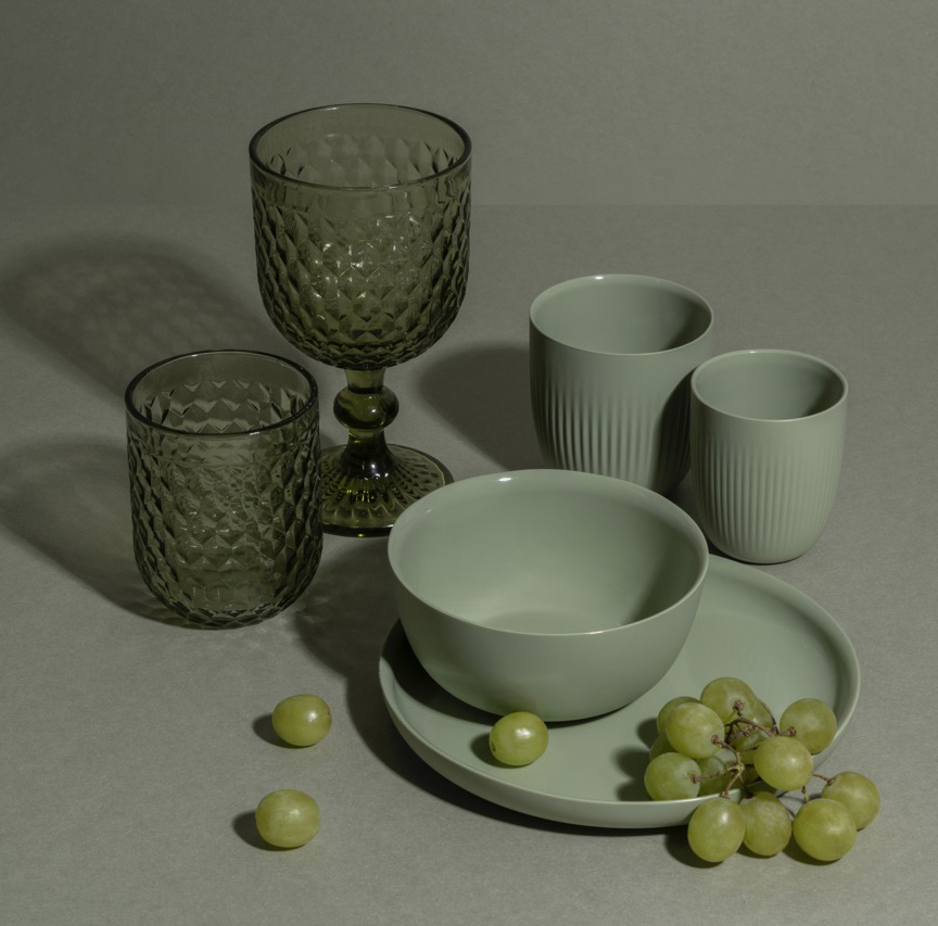
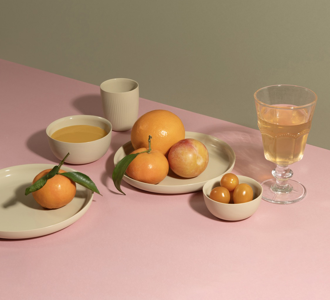
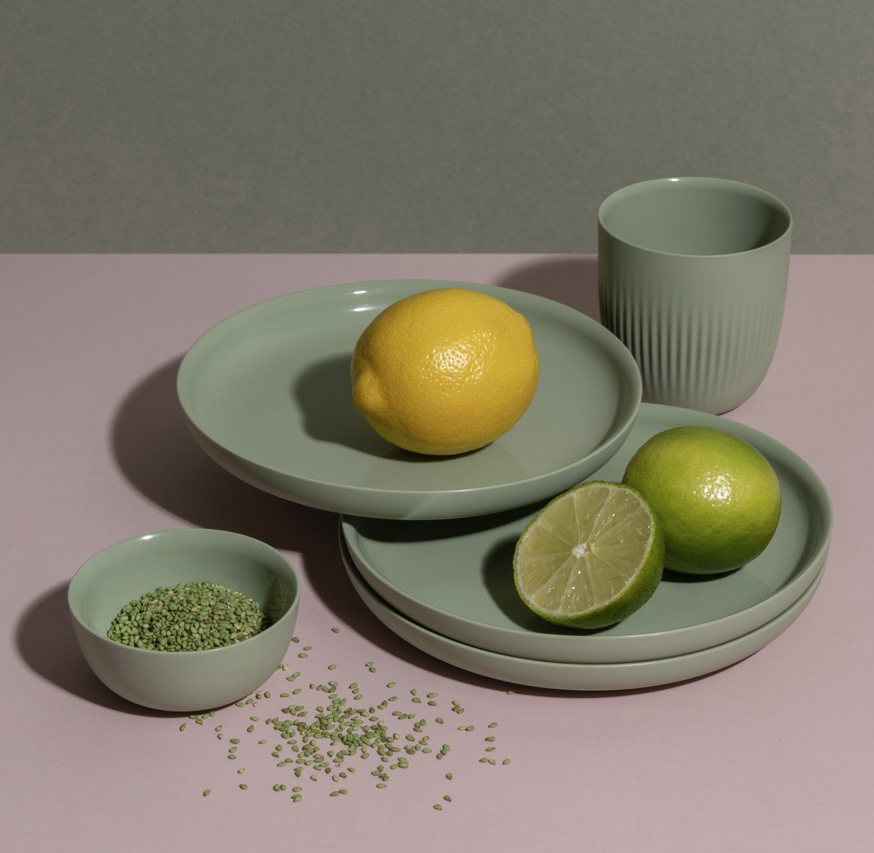
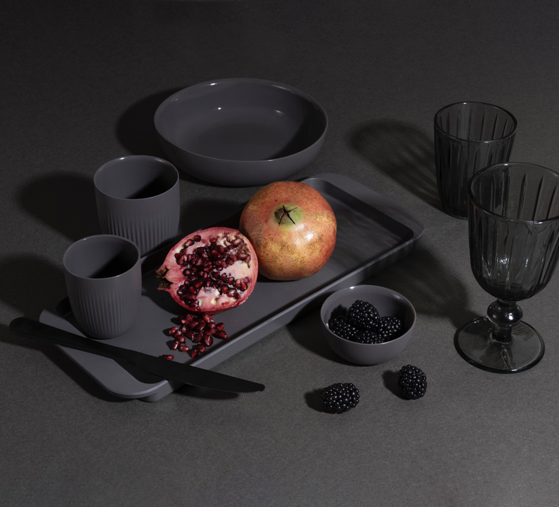
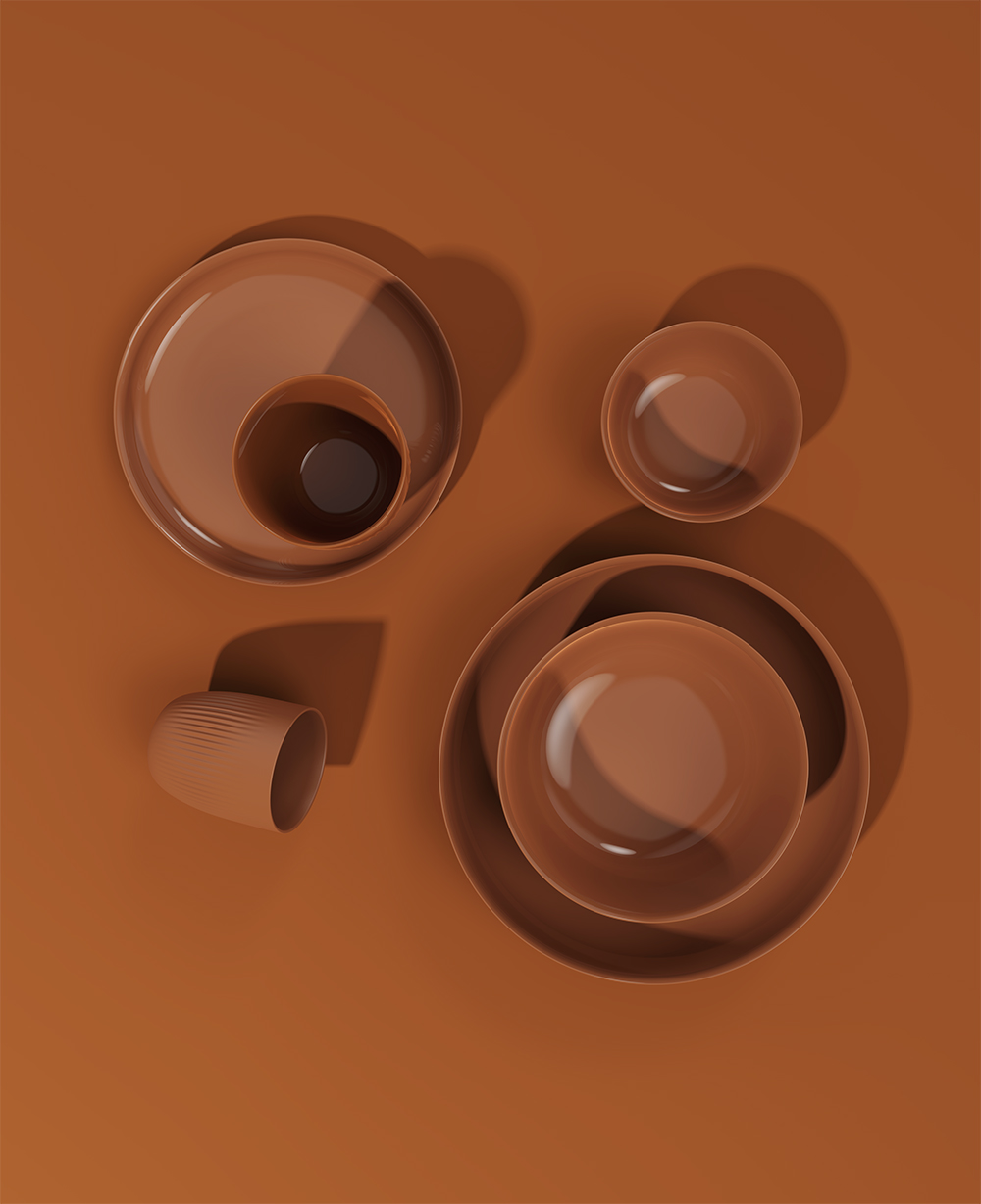
To steer the brand in a more contemporary direction, we began by reimagining its imagery and product photography. Our proposal centered on highlighting the bold colors and unconventional materials that define the Nat Spirit collection.
Originally rooted in bamboo tableware, the brand has since expanded into silicone, enamel, and an upcoming resin line—materials that share the distinctive qualities of being nearly indestructible, lightweight, and ideal for both children and older users.
Their durability also makes them perfectly suited for a wide range of environments: camping and glamping, outdoor dining, boating, desert camps, and more.
While the earlier visual identity emphasized the sustainability of bamboo, the renewed direction celebrates the brand’s versatility—its diverse applications, playful color palette, and the inherent flexibility of its materials.
Silicone, Enamel and Bamboo Collections
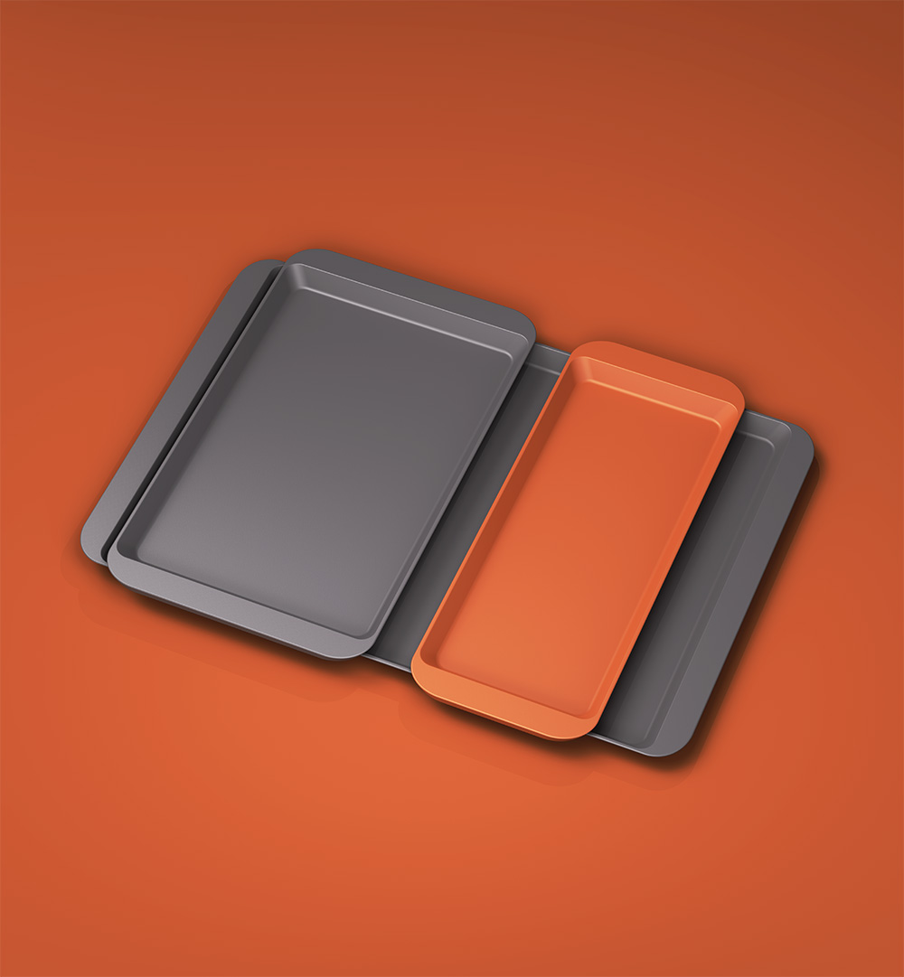
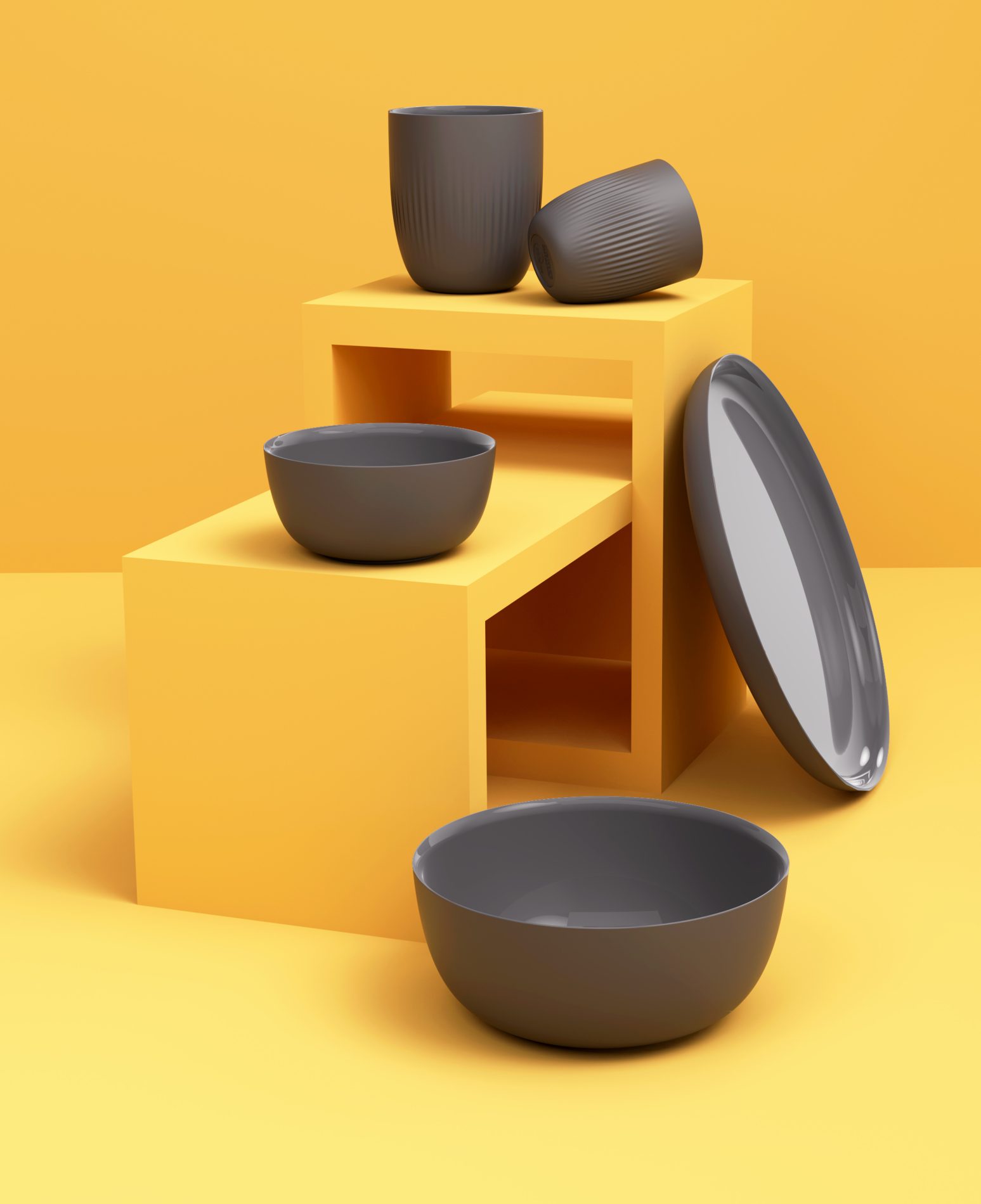
Art direction for the new materials and for the upcoming models in the Bamboo Collection.
Photography by Bea Schulze and Ricardo Leal and internally within the Nat spirit team. 3D renders by Marta Ribera.